Between the weekly briefing and the real-time stream, there was nothing.
The AI Briefing gives you a weekly/monthly pulse. The event stream gives you real-time raw data. In between — the 24-hour window that founders actually care about — there was nothing. Did anyone activate yesterday? Did the signup funnel shift? Are errors spiking? Are identified users stalling? You had to go hunting across dashboard pages to piece it together. The daily feed is that missing pulse.
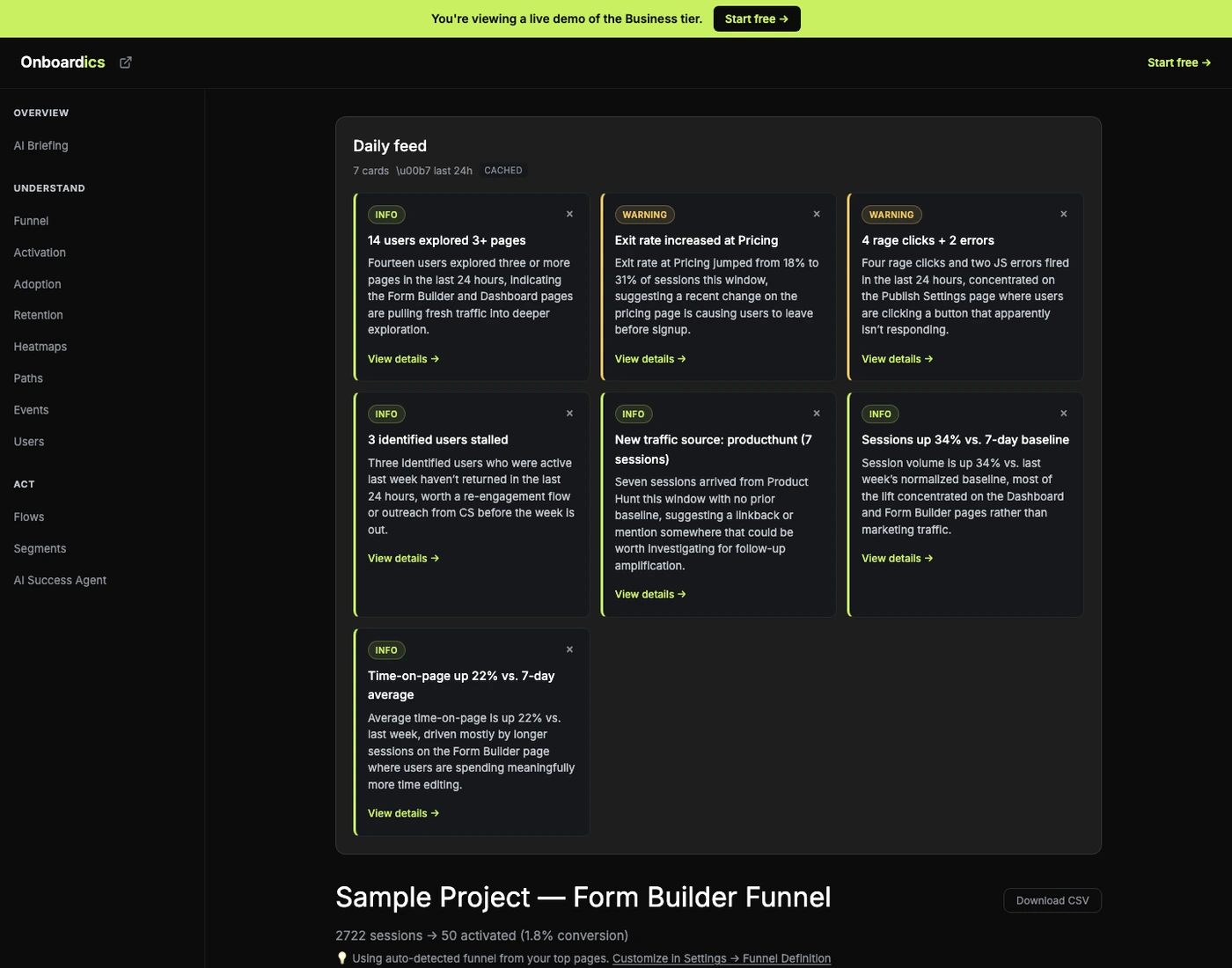
Eight signals rolled up into cards
The feed queries your project’s last 7 days of events in one pass, compares the current 24-hour window to a 7-day baseline, and surfaces up to 8 cards — one per signal that actually changed:
- New activations: users who hit 3+ unique pages in the window.
- Drop-off shift: any exit page whose rate moved >10% vs. baseline.
- New cohorts: UTM sources new in the window with ≥5 sessions.
- Anomalies: rage clicks + JS errors counted this window.
- Stalled users: identified users seen in baseline but not current.
- Volume delta: session count ±20%+ vs. baseline-normalized.
- Engagement shift: average time-on-page ±15%+ vs. baseline.
- Flow conversion change (coming soon) — flow completion rate shifts vs. baseline.
Cards with no signal simply don’t render — the feed never pads with filler. If only 3 of the 8 aggregators fired, you get 3 cards.
One sentence per card (Diagnose+) — facts only
On Diagnose and above, each card gets a one-sentence AI narrative tied to the specific metric data. The prompt is narrow by design: exactly one sentence, 15-30 words, no exclamation marks, no hype, humanized page paths. Just what happened and why it matters.
Exit rate increased at Pricing. Exit rate at Pricing jumped from 18% to 31% of sessions this week, suggesting something on the pricing page is losing users who would have otherwise continued to signup.
12 identified users stalled. Twelve users who were active last week haven’t returned in the last 24 hours, worth a re-engagement flow or outreach from CS.
Factual cards on Free, AI narratives on Diagnose
Free tier gets the same 8 aggregators and card data — activation counts, drop-off shifts, anomaly counts, etc. — but the narrative field is blank, replaced with a “🔒 AI narrative available on Diagnose” teaser. The factual data alone is often enough to drive the habit of checking the feed daily. Diagnose and above unlocks the daily AI narratives across all 8 cards; Scale and Business add upcoming Slack/email forward on top.
Where you see it
The feed has its own dedicated page at /dashboard/feed, listed under OVERVIEW in the sidebar right alongside the AI Briefing. The pairing is intentional: AI Briefing is your weekly/monthly strategic pulse (grade + top 3 actions + healthy signals); Daily Feed is your daily tactical pulse (what changed today). Every card has a deep-link to the relevant dashboard page — click “View details →” on the drop-off card and you land on Funnel, click it on the stalled-users card and you land on Users, and so on. Cards are dismissible (× per card), and dismissed cards stay hidden for 7 days then reappear if the underlying signal is still strong.
One AI call per project per cadence window
The feed doesn’t burn Anthropic budget on mount. Cached reads are free (returned instantly from insights_cache). Generation happens once per cadence window per project — once a day on Diagnose and above — and serves every team member on the project from the same cache entry. Dismissal state is local per team member (no cross-device sync for v1). Budget math: ~$0.03 per generation, 1 generation per project per day, predictable and bounded.
Tier access
- Free: Factual cards only (no AI narratives). Cards still show counts and metrics — enough to see what’s changing. “🔒 AI narrative” teaser on each card.
- Diagnose: Daily AI-summarized feed. Regenerate button. Unlimited.
- Deploy: Same daily AI feed as Diagnose plus the no-code flow builder + A/B testing tier.
- Scale: + Slack/email forward per card (coming soon). + 24/7 feed in the background across unlimited team members.
- Business: + AI Success Agent triage (“what should I act on first?”) on top of the feed. Same daily cadence as Diagnose+.
Pricing
Daily feed is on every tier — Free gets factual cards, Diagnose and above gets daily AI narratives. No tier gets upcharged for the feed itself; the AI narrative is the upgrade lever. Try it on the interactive demo.