The problem
Your users get stuck, but fixing it means writing a ticket, waiting for a sprint, and hoping the developer builds what you imagined. By the time the fix ships, the users who needed it have already churned.
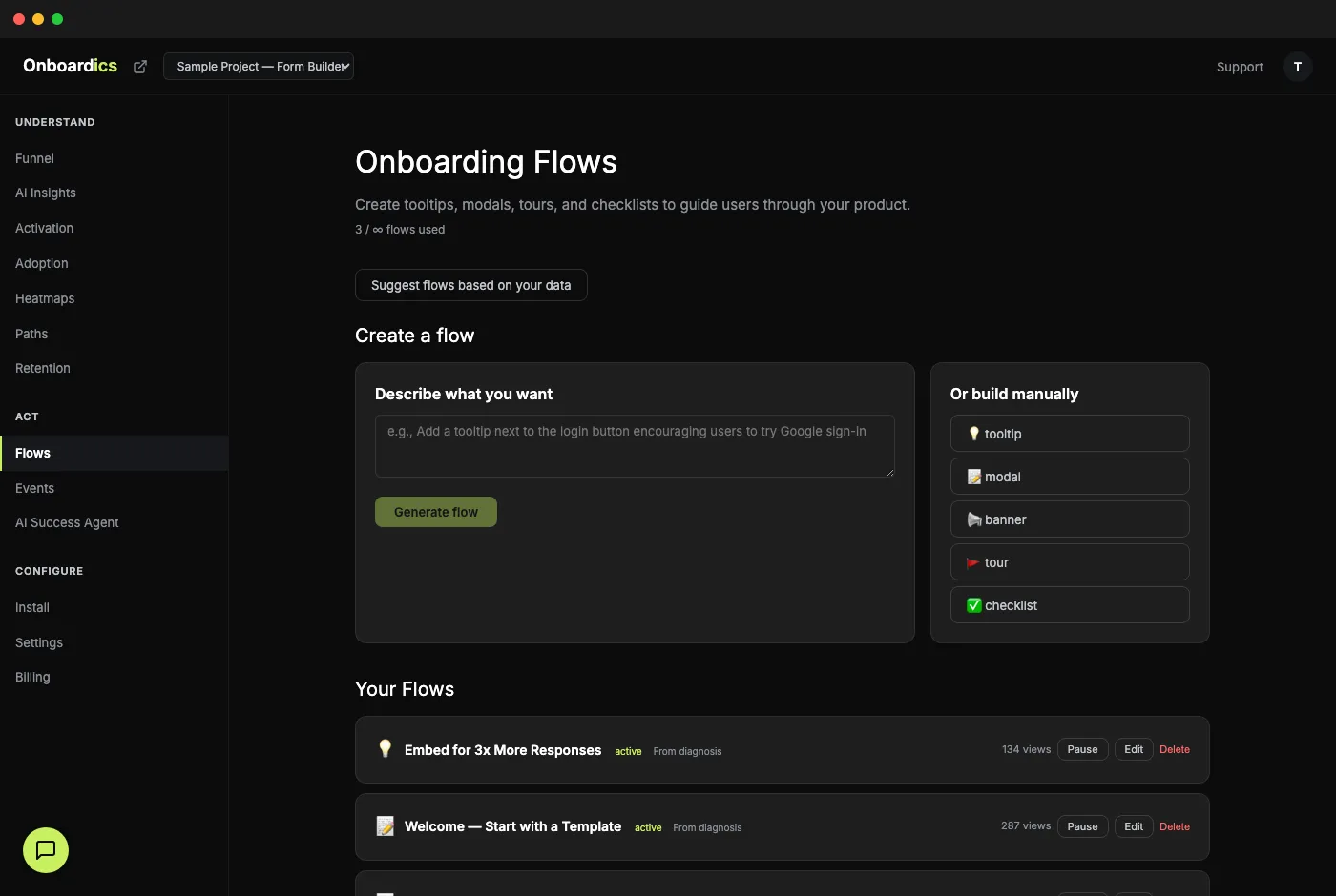
How it works
Describe or choose
Tell AI what you want in plain English ("show a tooltip on the pricing page explaining the free tier"), pick from AI-suggested flows based on your actual user data, or build manually with the visual editor.
Customize with guardrails
Every field has a (?) HelpTip icon that explains what it does and when to use it. Theme toggle, accent color picker, segment targeting, visitor-type filtering, page patterns — every decision is reversible before you publish.
Deploy instantly
Flows go live the moment you publish — no code deploy, no release cycle. The Onboardics snippet renders them inside your product using Shadow DOM isolation so they never break your existing CSS.
Five flow types
- Tooltip: small anchored bubble pointing at a specific element. Best for feature hints and inline education. Positions above / below / left / right of the target, tracks scroll.
- Modal: center-screen overlay with a headline, body copy, and a primary CTA. Best for high-intent moments — onboarding walkthroughs, milestone celebrations, critical announcements.
- Banner: full-width strip at the top or bottom of the page. Best for persistent messages like beta announcements or trial countdowns without blocking the UI.
- Tour: multi-step guided walkthrough that highlights each element in sequence. Best for first-run onboarding — 3–5 steps to the aha moment.
- Checklist: persistent floating widget tracking progress toward activation. Best for multi-session activation flows where users come back over days. Progress syncs across sessions.
Triggers — when should it fire?
- Page load: fires immediately on matching pages. Good for announcements and first-visit tours.
- Time delay (1–300 seconds): fires after N seconds on the page. Good for engagement hints — wait long enough to know the user isn't bouncing.
- Scroll depth (1–100%): fires when the user scrolls past N% of the page. Good for marketing-page CTAs that prove the user read.
- Exit intent (desktop): fires when the mouse moves toward the browser chrome. Good for save-the-sale interventions. Desktop-only — mobile doesn't have a cursor.
- Element click: fires when the user clicks a specific element (by CSS selector or plain-English description).
Audience — who should see it?
- Page patterns: comma-separated paths with wildcard support.
/dashboard/*, /settingsfires on any dashboard page plus the settings page. - Visitor type: all visitors, logged-in users only, or anonymous users only. No code required — the snippet detects identify() state automatically.
- Audience segment: target flows at AI-defined audience segments (Diagnose+). “Users who visited pricing 3+ times but haven’t signed up” → pick the segment from a dropdown.
Styling — match your product
- Theme toggle: dark or light. Pick the one that matches your product's current surface.
- Accent color picker: 6 preset brand colors plus a custom hex input. One color applies to every step in the flow — CTAs, step highlights, the tour spotlight.
- Shadow DOM isolation: all rendering happens inside a shadow root. Your product's CSS never leaks in; Onboardics styles never leak out.
Plain-English CSS selector
Tooltips and tours need to anchor to a specific element on the page. Usually that means finding the right CSS selector — which means opening DevTools, inspecting, and guessing whether a className is stable.
Onboardics gives you a second option. Describe the element in plain English — "the Create Form button on the dashboard" — and AI translates it to a stable CSS selector by reading the elements your tracking snippet has already captured in click events. No DevTools, no guessing.
Target segments built from your own events
Page views and clicks get you most of the way. But "users who published 3+ forms" or "users who completed onboarding but haven't invited a teammate" requires product-specific events only you know how to define.
Drop window.__onboardics.track('form_published', { form_id: 'abc' }) into your app wherever a meaningful action happens, then describe the segment you want in plain English at Settings → Define Audience Segments. AI translates "users who triggered form_published 3+ times" into a rule the tracking snippet evaluates client-side. Pair the segment with any flow for targeted delivery.
Behavioral events beyond clicks and page views are captured automatically and also available to segments:
- Engaged readers:
scroll_depth.max_scroll_pct ≥ 75on 3+ blog posts → show a "subscribe for more" tooltip only to visitors who actually read. No more interruption-begging popups to users who bounced in 5 seconds. - Returning visitors going deeper:
session_end.page_count ≥ 5ANDvisit_count ≥ 3→ show an upgrade prompt to users showing real product fit.
Prove it actually worked
Every active flow gets a conversion-impact card on the Flows page showing before/after conversion rates for the flow's target audience. Two-proportion z-test flags statistical significance at p<0.05. No more “I think it's working” — you get a credible “+12% conversion (3.2% → 8.4%, 250 sessions each window)” screenshot to paste into your stand-up, investor update, or internal Slack.
The impact card is the difference between guessing and knowing. It auto-unlocks 14 days after activation (enough runtime for a reliable measurement) and stays visible for every active flow.
Also included
- AI flow generation — describe what you want, AI builds the steps and drafts the copy
- "Create flow →" from any AI diagnosis recommendation — one click from problem to fix
- A/B testing (Scale+) — split traffic between flow variants, track conversion per variant with statistical significance
- SPA-aware — works with React, Next.js, Vue, Nuxt, and other single-page apps without extra configuration
- One-at-a-time queuing — multiple flows never overlap or fight for attention
- Edit from any card, dismiss suggestions, clear all — flows-page UX designed for iteration speed
- Stale-selector detection — a daily check flags any tooltip or tour flow whose target element hasn’t been clicked in 7+ days. You see a warning in the Flows dashboard before a refactored class name silently breaks your onboarding. Fix in one click by switching to the plain-English element matcher, which re-resolves against current click data instead of a hand-coded selector.
Pricing
The flow builder unlocks on Deploy ($249/mo) with unlimited flows and A/B testing built in — Diagnose ($149/mo) is the analytics-only tier (no flow builder). Segment targeting is a Diagnose+ feature via AI-defined audience segments.